MultiScroll
https://www.muse-themes.com/products/multiscroll
MultiScroll is a powerful widget that is sure to create a dramatic effect on any site. This widget creates a fullscreen presentation by scrolling page content in opposite directions simultaneously.
This widget should be considered for desktop use only, as management of side-by-side content can be challenging on narrow devices such as phones.
- Compatibility: Muse 2017.0
- Current Version: 1.0
- Supported Devices: Desktop, Mobile, Tablet
Release Log
- 1.0: Initial Release
Setup
WIDGET PLACEMENT
- Drop the widget into place on your page in Muse.
- Set the widget width to "Stretch to Browser Width" in the Resize dropdown menu.
- In most cases, the widget should be placed at the very top of the page. If you are using a header, or do not want the widget placed at the top of the page, you may place the widget below the top. However, since the widget takes up a large amount of space, placement at or near the top of the page is ideal.
BREAKPOINT MANAGEMENT
- This widget should be used on desktop sizes only. While it may be possible to view the widget on smaller screens, it is not advisable. Content within the vertical panels becomes challenging to manage, and widget performance is not reliable in narrower widths. We suggest using this widget at widths larger than 900px or so.
- It is important to hide the widget on all breakpoints below desktop.

- In addition to hiding the widget, all elements pertaining to the widget should also be hidden in lower breakpoints, such as content elements. More on content elements below.
- The final step in breakpoint management is to use the "Specify Mobile Browser Size" setting in the widget options. Set this value to match the breakpoint size that the widget is placed on. For example, if your widget is placed on a 960 breakpoint, set the Specify Mobile Browser Size to 960.

PLANNING YOUR SITE FOR MULTISCROLL
- This widget creates a full screen presentation. This should be considered when planning the site layout.
- This widget should not be used on a page that will contain other page items that cannnot be placed within content elements (discussed below). In other words, this widget can not be used on a single page scrolling site.
- Headers, footers, buttons and other elements may be used on the same page, though you must use layers and a master page. See the next section for details.
PROPER USE OF LAYERS AND MASTER PAGES
- If you wish to use a header, footer, button, or other element on top of MultiScroll, you must use layers or a master page.
- Header/Footer: If you wish to use a header over the MultiScroll, make sure that the header is on a master page, and is on a layer above the multiscroll widget. You may use the same master page as the rest of your site, or use a separate master page that is built uniquely for the MultiScroll page. It is advised that the header or footer are minimal in height and page space.
- Buttons and other elements: Place buttons or other elements where you like on the page or master. These elements need to be on a higher layer than the multiscroll widget.
WIDGET OPTIONS
- Open the widget option panel.
- Enable Navigation: This setting enables the navigation dots seen on the right side of the screen.
- Use the Navigation Color to set the color of the navigation dots and outlines.
- Specify Mobile Browser Size: This setting sets the browser width at which the widget will be hidden. This setting is important, and must be used. The widget should only be used on desktop. Match the value here with the size of the breakpoint the widget is placed on.
- Content Graphic Styles are discussed below.
CONTENT GRAPHIC STYLES
- All of the content seen in MultiScroll needs to be created as content elements. These elements are best created with State Buttons.
- The demo file that is included in the single product download is a good example of how content elements should be set up in Muse.
- Create 9 content elements by dropping 9 State Buttons into your project. You may drop one and duplicate.
- We suggest making the State Buttons around 800x800px. You may make them larger or smaller. Though you will want them to be large enough to control positioning of elements on the page. For example, if you used State Buttons of 200x200px, any text element within would appear near the top of the page when published, since 200px is the lowest point on the page that you can place content. Also keep in mind that the desktop width of the browser will be double the width of a single State Button. 800x800px sizing allows the browser to comfortably be expanded or shrunk above or below 1600px.
- Place the State Buttons off canvas, to the right or left. Be sure to not place the elements on canvas. In the screenshot below, you can see the six State Buttons arranged off canvas.

- To speed the process of setting up your content elements, you may clear the State Button content and styling. Right click the State Button, then perform these actions from the R-click menu (they must be done separately). It is best to do this before duplicating the State Button.

- Organize your State Buttons in a layout similar to how your published page will appear. There will be 3 left/right panel pairs. Arrange sets of 2 State Buttons side by side in a column (you may arrange the State Buttons however you like. We just find this arrangement the easiest.)
- Style each State Button with content as you like. You may place most anything in the State Button – text, images, etc.
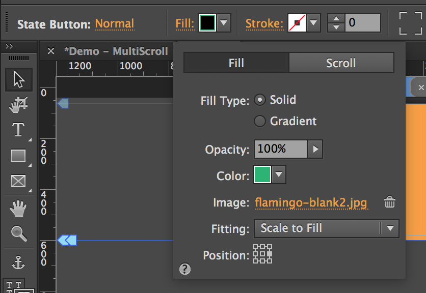
- In most cases, applying a fill to the State Button background is a good way to go. You may use a color, a color gradient, or an image. If using an image, be sure to set the Fill settings properly.
- The Fitting setting should be set to "Scale to Fill" in most cases.
- Position should be set to right-center for content panels on the left side, and vice versa. This keeps content centered nicely on the page when published.
- The Resize options for your State Buttons should be set to Responsive Width in most cases.
- Click on each State Button one at a time to select them and apply Graphic Styles. Apply a unique Graphic Style to each State Button.
- Use a naming scheme that makes sense to you. We prefer to use naming like "scroll-1L", "scroll-1R", "scroll-2L", "scroll-2R" and so on.
- Enter these Graphic Style names into the widget option panel. Note that the ordering of the fields may differ from your arrangement and naming scheme. In other words, double check that you are placing the correct Graphic Style names in the correct field.
You may want to give the page a preview in browser at this point. Ensure that the Multiscroll function is working correctly. You will inevitably need to make adjustments for things to display just as you like. Continue to tweak placement as needed to achieve the desired effect.
PREPARING IMAGES IN A PHOTO EDITOR
If you plan to use images in MultiScroll, image preparation will be vital. These steps require some basic skills in photo editing software such as Photoshop.
- If you would like to use MultiScroll to split full screen images, use these preparation steps.
- Select an image to be used in a left/right panel combination.
- Crop the image in a 2:1 ratio.
- The image will now need to be split into two 1:1 square images.
- Use the rectangle selection tool to select exactly half of the image. Set a ratio of 1:1 for the rectangle tool.
- Select the left or right half, and copy it.
- Create a new file, and paste the image half. Save the file.
- Repeat this process for the other side of the image.
- You will now have 2 new image "halves". Name them appropriately.
- Repeat this process as needed for the desired number of panels.
- You may now use these image halves as background fills in your State Buttons.
Commonly Asked Questions
How can I use more than 3 panels?
Our widget only supports 3 panels at this time.
Can I see the Muse file used for the live preview?
Yes. It is included in the single product download. Simply download from the product page.
Known Issues/Conflicts
No known issues or conflicts
Additional Info Links
- Forum Link: http://forum.musethemes.com/categories/widgets.3/
- Update Log: http://www.muse-themes.com/pages/release-log.html